If
we advertised this:
And
sent you this:
I
bet you would send it back.
The
following is taken from our 'Bronze'
page.
Many
manufacturers we've reviewed do etch bronze and other metals. Plaques&Letters distributes
products by Matthews Bronze and Gemini. Following are two
quoted paragraphs from their Web site.
Gemini
Signs & Letters
“The
etching process allows you to replicate your photograph,
line drawing or complex artwork. This method utilizes a halftone
dot pattern made from a 50-line screen. Halftone portraits
resemble newspaper photographs, and have visible dot patterns.
The recessed dots are black infilled to contrast with the
satin finished metal background.”
Matthews
Bronze
"Cast
Bronze Plaque Etched Portraits Appliqués:
This process utilizes a halftone dot pattern acid-etched on .100" thick
bronze plate. The etched, recessed dots are infilled with black to
contrast with the satin-finished background. The best photographs for
etched portraits have high contrast tones with bright white areas,
dense black areas, and minimal gray tones."
Gemini
says they use a 50 line screen,
about what they use on silk screen T-shirts. Newspapers use
an 85 line screen. Magazines use 133- 150 line screens. There's
a big difference, especially when we talk about image resolution.
On their Web site Matthews recommends 72
- 300 dpi images. Keep the two figures (in yellow)
in mind as you read on.
I
have prepared the following so you can better understand
how we differ and why we call our imaging 'High
Resolution' no matter what the competition
calls theirs. There is a difference!
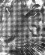
For
this demonstration I used three grayscale (8 bit) scans,
one @ 72 dpi (dots per inch), one @ 300 dpi, and one @ 1,200
dpi - the resolution we use. I then converted these to black & white
bitmap (1 bit) images in Photoshop using one of three line
screens - 50 lpi (lines per inch), 85 lpi, and 133 lpi -
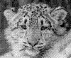
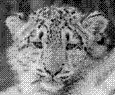
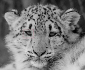
the line screen we use. I used the image below for this demonstration.
The red box around the eye was the sampling area. I had to
use a small area because putting the large images on the
site would be impractical. The small area serves the purpose.
As
I mentioned, I did the line screens in photoshop. During
production we use an imagesetter to produce a halftone screen
at 2,450 dpi. The imagesetter is superior to using Photoshop
for that procedure. But these Photoshop screens will show
you how dpi and lpi relate to final halftone resolution.
Answers.com defines a halftone as:
Click
any of the nine images below for enlargements.
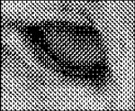
72dpi
- 50lpi |

72dpi
- 85 lpi |
72dpi
- 133 lpi |
| Above
you see the section of the snow leopard's right eye
(red square). They are identical. Why is that? At a
low resolution, like 72 dpi, there is not enough information
in the grayscale image for the program to interpolate
a round dot, so it uses what information it has to
produce a screen. For a detailed definition of a grayscale
image you can click here. |

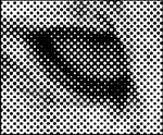
300dpi
- 50lpi
|

300dpi
- 85lpi |
300dpi
- 133lpi |
| In
this series of images a 300 dpi photo was used. The
program can do better at determining a round dot in
the first image, but at 85 lpi it breaks down. You
can see quite a difference between the 50 lpi screen
and the 85 lpi screen - more image detail. There is
virtually no difference
between the 85 lpi and the 133 lpi screens. There's
not enough information in the image. |

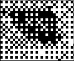
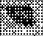
1200dpi
- 50lpi |
1200dpi
- 85lpi |
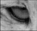
1200dpi
- 133lpi |
| You
can see a big difference in the 1,200 dpi image. There
is a very distinct difference in all three screens.
The image resolution in the third frame is superior.
That's why we use it. That's high resolution. Some
of the dots in the third image are 11 thousandths of
an inch. We've actually imaged a dot of 1/10,000". |
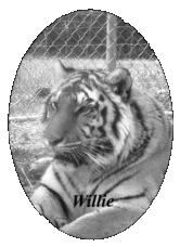
To
give you a better idea of how an imagesetter differs from
Photoshop I scanned an actual piece of film - left picture
above. The film was set at 133 lpi using a 1,200 dpi image. Click on
the image to see how the dots look. The picture of Willie,
on the right, is a reduction of that larger image.
Product
Dispaly & Web Images
Now
I want to address the issue of reproducing halftone images
on the Web as it pertains to product display. The rendition
of products that feature halftone images can be deceptive.
We fall into this predicament ourselves. Fortunately our
final output is represented quite faithfully through the
images you see on htis site.
When
I visited a competitor's site I saw a small picture of
an etched portrait on bronze. I discuss these on our 'Bronze'
page. That small picture appears photo realistic even though
I know the company is using a 50 line screen and at most
a 300 dpi image. They did not offer a high resolution download
or a large photo link so one could more closely examine
the detail. Although I've found that a larger photo does
not necessarily give you the information you seek. Why
do these pictures look like photos? The answer lies in
the digital reproduction and the reduction.
When
we reproduce products for presentation on the Web or in
catalogs we either take photographs or perform scans. The
common denominator for all of us is that we cannot accurately
reproduce an image that is made using a black and white
halftone. Those images have 1 bit per pixel information.
If we take a digital photo (RGB) the pixel information
is 24 bit. If we scan a photo in grayscale the pixel information
will be 8 bit. If you try to scan the image as a black & white
bit map the result is not representative, to say the least.
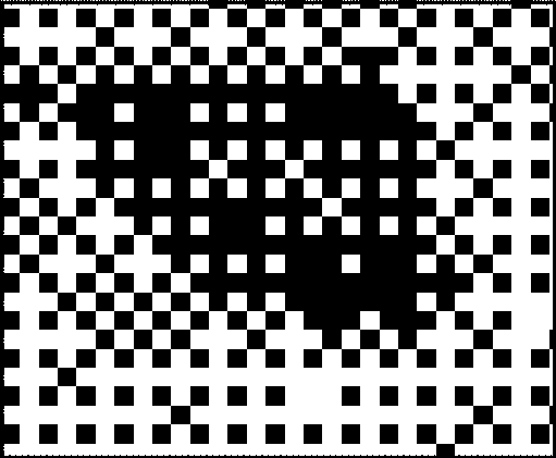
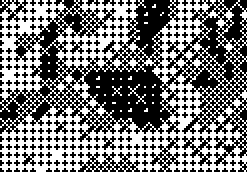
Below is a bit map scan of a small section of our soldier
tribute. What a mess. That does not represent the image.
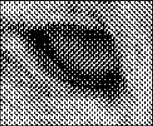
If
we take a grayscale scan and try to convert it to a bit
map you get something like this:
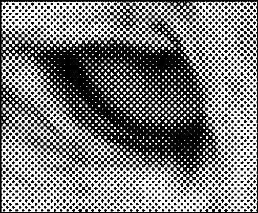
I
want to show you how the additional information in a grayscale
can affect the resampling of an image. The image below
is 72 dpi that's been screened at 50 lpi creating a halftone
(bit map). Even though it looks like there are gray areas
in the image, it's all black dots. (See
the 72dpi - 50lpi cut out in the group of nine images at
the start of this presentation.)
If
I take this same image and resample it down to a smaller
version (42% of the original - dpi remained the same) this
is the result.
The
program attempts to interpolate the limited information
available when forming a new image. Below is a 200% resample
of the eye area. When performing the enlargement the program
added small black dots. Resampling upward is not recommended
in most cases.
I
took the same bit map image
of the snow leopard, 3rd above, and converted
it to grayscale. The resulting 8
bit image looked exactly the same as the 1 bit image.
However, when I reduced or enlarged it the program used
all that additional information to render a different result.
Below is the grayscale image reduced to 42% of the original
- dpi remained the same.
Quite
a dramatic difference, wouldn't you say? Those nine small
images of the eye area at the beginning of the presentation
are all grayscale reductions of the larger .gif images.
The .gif format can render
bit map images. The .jpg format cannot.
When I reduced the large 1 bit images to make smaller representations
the results were unsuitable - carved out dots all over
the place. So, for better thumbnails I had to convert to
grayscale.
When
we take a higher resolution 8 bit or 24 bit digital image,
reduce the dpi and dimensions, and use it for a Web presentation
we get the effect represented above. The higher resolution
image that revealed the dot pattern, even though its been
endowed with more pixel information than the halftone,
looks like a continuous tone photo when reduced. Refer
to the two samples of Willie.
The greater the reduction the tighter the image gets. (The
reason we scan at higher resolutions, or use a descreening
option, is to remove the moiré patterns you get
when scanning halftone images. Pronounced "mor-ray" and
spelled "moiré." In computer graphics,
a visible distortion. It results from a variety of conditions;
for example, when scanning halftones at a resolution not
consistent with the eventual printed resolution or when
superimposing curved patterns on one another.)
So
I now know the small thumbnail image of that etched bronze
plaque produced using a 50 lpi screen
I saw on the Web would not be
representative if I could see the actual product.
The
option I chose as most enlightening - one where you can
see a representation of the image's halftone - was to do
a high resolution scan (1200 dpi) of the film used in the
production of a tribute. Even though the scan produces
a grayscale representation, the high resolution reveals
the dot pattern quite nicely. Ask other manufacturers to
provide a similar scan (1200 dpi) of one of their films
so you can compare apples
to apples.
The
Gallery images do represent our tributes very well. They
actually look like our scans. Our Archival
Resolution images coupled with a 133
line screen yields photo realism on
our metal tributes and jewelry that others have not achieved.
Immortal Memories™ tributes will faithfully represent
our loved ones and immortalize your thoughts for ages to
come.
Never
Forget!